

On the Appearance page, you decide how your LeadWin agent looks on your website before anyone clicks it: logo, colors, the icon in the launcher, its position and the color scheme. This way it matches your corporate design and feels like part of your website. The launcher is the round button at the bottom of the page that visitors click to open the chat.
At a glance
- You find the page in the LeadWin dashboard under Appearance → Appearance.
- Logo, position and color scheme are included in every plan. Custom colors are available from Basic, a custom launcher icon and hiding Powered by LeadWin from Pro. You find an overview of all limits in Plans compared.
- You upload logos as PNG, JPG or WebP up to 2 MB. The launcher icon may be up to 1 MB, ideally square and at least 96 × 96 px.
- Visitors see every change on their next page view. You do not need to install the code on your website again.
- Owners and admins can see the page. You decide who has which role under Team.

How it works
Without any settings of your own, your LeadWin agent appears as a round launcher at the bottom right, in LeadWin violet and with the animated Sparkles icon. It tells visitors at a glance that an AI answers here. A click on the launcher opens the chat.
Your accent color fills the launcher, the send button and the buttons in the chat. The speech bubbles and the trust signals at the launcher use it too. Campaigns can have their own colors. The logo does not appear in the launcher. It appears in the header and footer of your help center and on the screen the chat shows while it reconnects.
All settings apply to one LeadWin agent. If you have several LeadWin agents, you design each one separately. This page has no effect on the answers of your LeadWin agent.
Almost everything on this page is saved when you click it: logo, launcher icon, the gradient switch, position, color scheme and branding. Only the color values you type into the color fields are applied with Save.
Every save is confirmed with Appearance saved. If it fails, you see Your change could not be saved. Please try again later. If uploading a logo or a launcher image fails, The logo could not be saved. Please try again. appears right at the field.
At the top right of the card, you see Done or Still open. The step is done as soon as you have saved a custom accent color, set the color scheme to Dark or API, or moved the launcher to the bottom left. The same step appears in the checklist under Getting started.
You check how your LeadWin agent looks in the live preview in the Launcher view. It always shows the saved state. Colors you have typed but not yet saved only appear there after saving.
Upload your logo
- Open Appearance → Appearance.
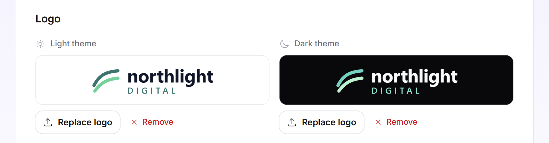
- In the Light theme field, click Upload logo and select a PNG, JPG or WebP file up to 2 MB.
- In the Dark theme field, upload a light version of your logo for dark backgrounds. This is optional: as long as the field is empty, LeadWin uses your light logo there.
The logo is saved immediately. With Replace logo you swap it, with Remove you delete it. Each field shows your logo on its own background, white or almost black. This way you see right away whether it is easy to read on both.
If you do not upload a logo, LeadWin uses the logo from your profile, if there is one. A note above the fields tells you so. If there is no logo anywhere, the Feedbax wordmark appears.
Set your own colors
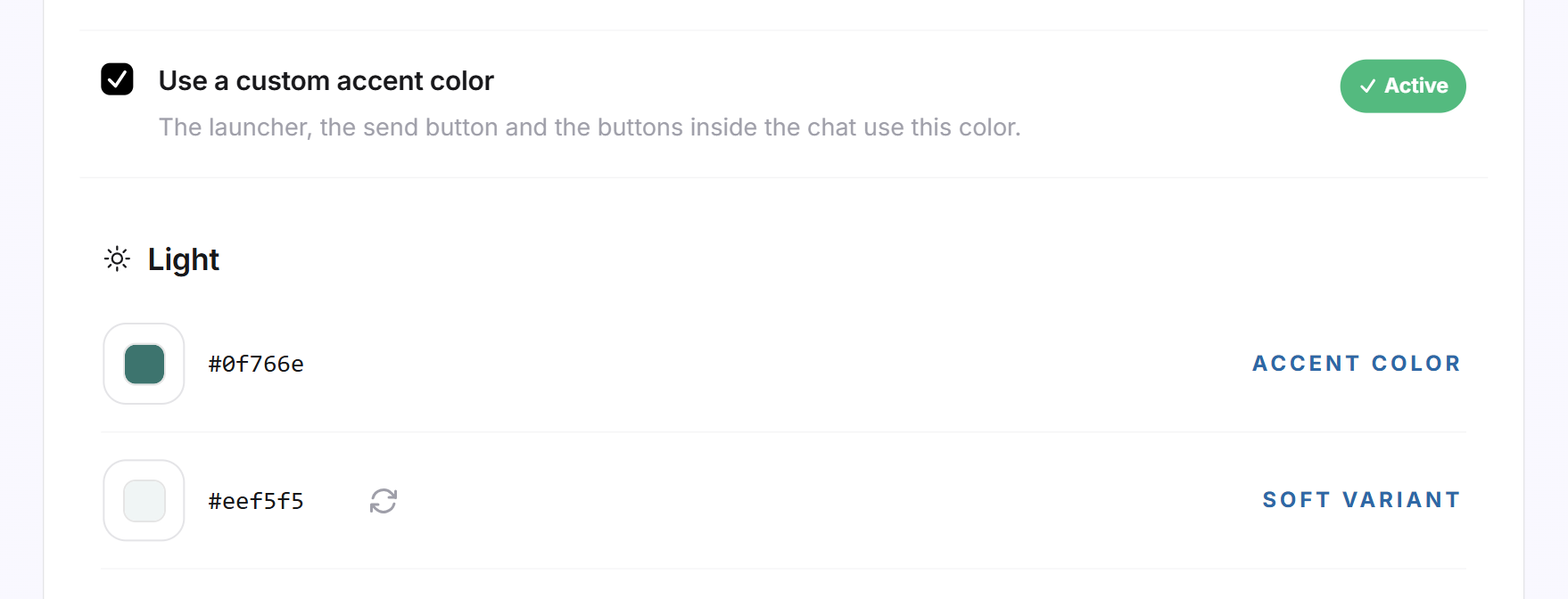
- Tick Use a custom accent color. Two groups appear below: Light and Dark.
- Under Light, enter your brand color at Accent color. Pick it in the color field or type the hex value, for example #0F766E.
- Check the other rows. LeadWin derives them automatically from your accent color, so you do not need to enter anything there.
- Click Save.
The rows mean:
- Soft variant is a light version of your accent color for quiet surfaces in the chat.
- The Dark group applies when your LeadWin agent appears in the dark theme. Its accent color follows your light accent color and is lightened where the dark background needs it.
- You can override every derived row. The arrow icon Derive automatically resets it. If you empty a field, the automatic value applies there again as well.
Each value needs exactly the #RRGGBB format, meaning a hash sign and six characters. If a value does not fit, Please enter a color in #RRGGBB format. appears below the row. Correct it and save again.
With the Gradient in the launcher switch, the circle gets depth instead of a flat fill. On light pages it runs into a darker shade of your accent color, on dark pages into a lighter one. Both ends appear as a Gradient row in the Light and Dark groups and can be overridden. The switch is saved when you click it. By default it is off.
Change the launcher icon
From Pro, you can put your own image in the launcher instead of Sparkles, for example the symbol from your logo.
- Under Launcher icon, select the Custom image tile.
- Click Upload image and select a PNG, JPG or WebP file up to 1 MB. For security reasons, LeadWin does not accept SVG files.
- The image is saved when you upload it and is selected right away.
A square image of at least 96 × 96 px works best. It is shown in full inside the circle and is not cropped. Two small previews show the launcher in the light and the dark theme, with your color and your gradient. With Replace image you swap the image. With Remove you delete it, and the launcher shows Sparkles again. If you select Custom image without uploading anything, nothing changes on your website.

Choose position and color scheme
Both settings are included in every plan, and both are saved when you click them. Under Launcher position, you choose Bottom right (default) or Bottom left. Pick the corner where nothing else sits on your website.
Under Theme, there are four tiles:
- System: your LeadWin agent follows the setting in the visitor's operating system, light or dark. If none is known, the light theme appears.
- Light: always light. This is the default for new LeadWin agents.
- Dark: always dark.
- API: your website sets the color scheme itself, with the call LeadWin('theme', 'dark') from the JavaScript API. Until the first call, the light theme appears. The call always applies only to the individual visitor.
Tip: If your website has its own switch for light and dark, choose API. Your LeadWin agent then switches together with your website and not with the visitor's operating system.

Hide Powered by LeadWin
In the open chat and on your booking page, the note Powered by LeadWin appears at the bottom. From Pro, you can hide it and present your LeadWin agent without LeadWin branding.
- Scroll down on the Appearance page.
- Tick Hide Powered by LeadWin. The setting is saved immediately.
What your plan includes
The basic settings are included in every plan. Your plan determines how far you can adapt the launcher to your brand:
| Plan | Logo, position, color scheme | Custom colors and gradient | Custom launcher icon | Hide Powered by LeadWin |
|---|---|---|---|---|
| Free | yes | no | no | no |
| Basic | yes | yes | no | no |
| Pro and trial | yes | yes | yes | yes |
| Scale | yes | yes | yes | yes |
Feedbax Business comes with the limits of Basic, Premium with those of Pro and Enterprise with those of Scale. You find more on this in LeadWin in your Feedbax plan.
If your plan lacks a feature, it carries the Upgrade label. A click on it or on the locked row takes you to the pricing page. If you have a Feedbax plan, the Feedbax pricing page opens instead. How to change your plan is explained in Manage, change and cancel your plan. With Basic, your LeadWin agent wears your brand colors. With Pro, it looks entirely like your own tool: with your icon in the launcher and without LeadWin branding.
If your plan or your trial ends, all values stay saved. Visitors then see the LeadWin color, Sparkles and the note Powered by LeadWin again. As soon as a suitable plan applies again, your settings reappear on their own.
Frequently asked questions
Why can I not tick Use a custom accent color?
Custom colors are available from Basic and during the trial. In Free the row is locked, and a click opens the pricing page.
Do I also need to pick a color for the dark theme?
No. LeadWin derives the dark accent color, both soft variants and both ends of the gradient from your one accent color. They follow it until you override them yourself.
Which files does the launcher icon accept?
PNG, JPG or WebP up to 1 MB, ideally square with at least 96 × 96 px. SVG does not work. The icon requires Pro or Scale.
What is the difference between the logo and the launcher icon?
The logo appears in your help center and in the chat while the connection is being restored. It is included in every plan. The icon replaces Sparkles in the round launcher and requires Pro.
What does the API color scheme do?
Your website tells your LeadWin agent for each visitor whether it should appear light or dark, with LeadWin('theme', 'dark'), 'light' or 'auto'. Until the first call, it is light.
My colors disappeared after the trial. Are they lost?
No. They stay saved and reappear as soon as your plan includes custom colors.
When do visitors see my change?
On their next page view. You do not need a new code for this.
My new color is missing in the live preview. Why?
The live preview only shows saved values. Click Save below the colors.